


FROM CONTEST TO MARKET
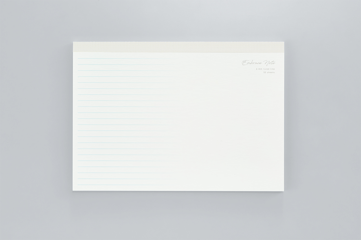
EMBRACE NOTE
〈2023 Merit Award〉
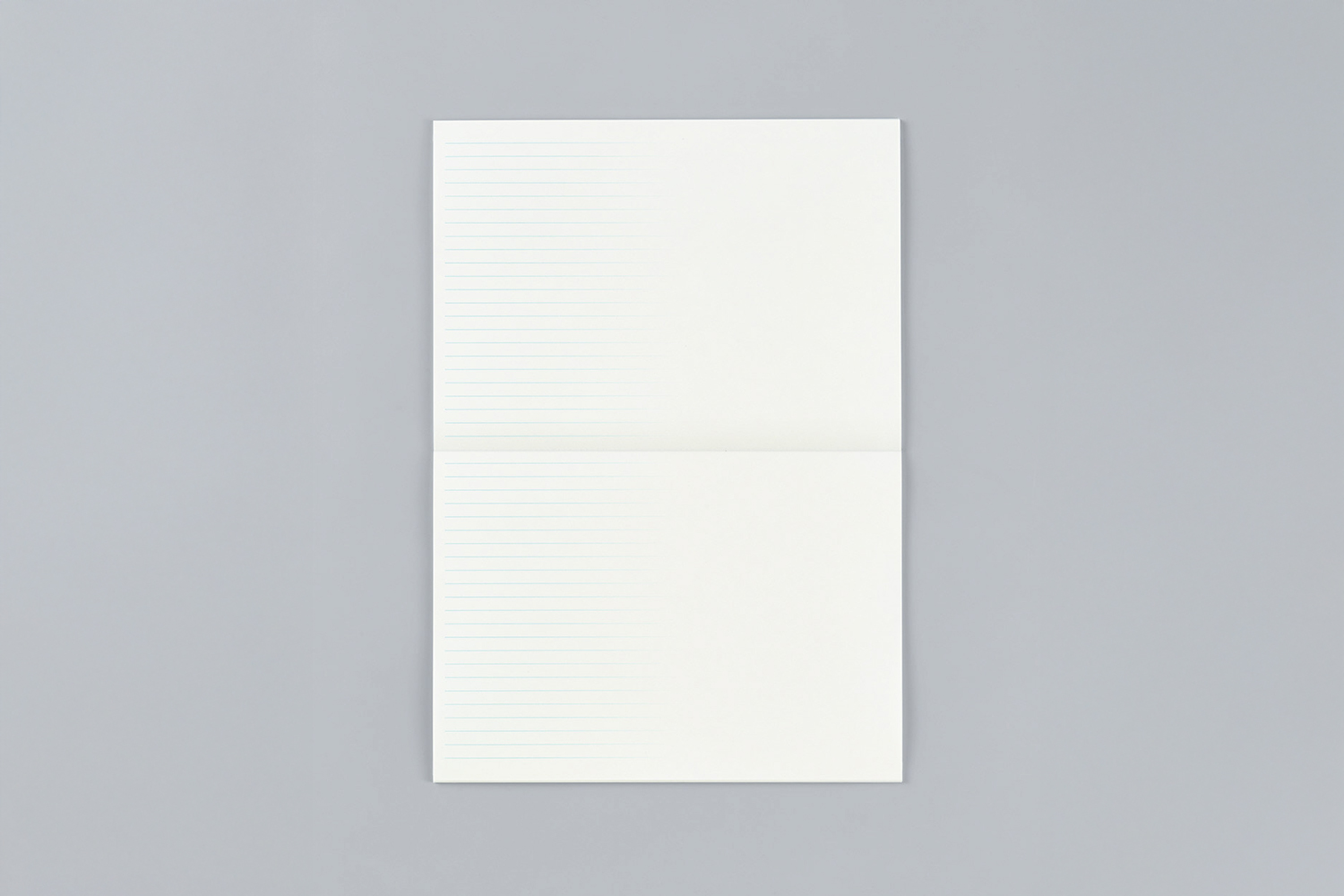
The most distinctive feature is its gradation where the lines seamlessly
blend into the margins.
Like the gentle ebb and flow of the tide, this subtle transition
provides a lingering writing experience.
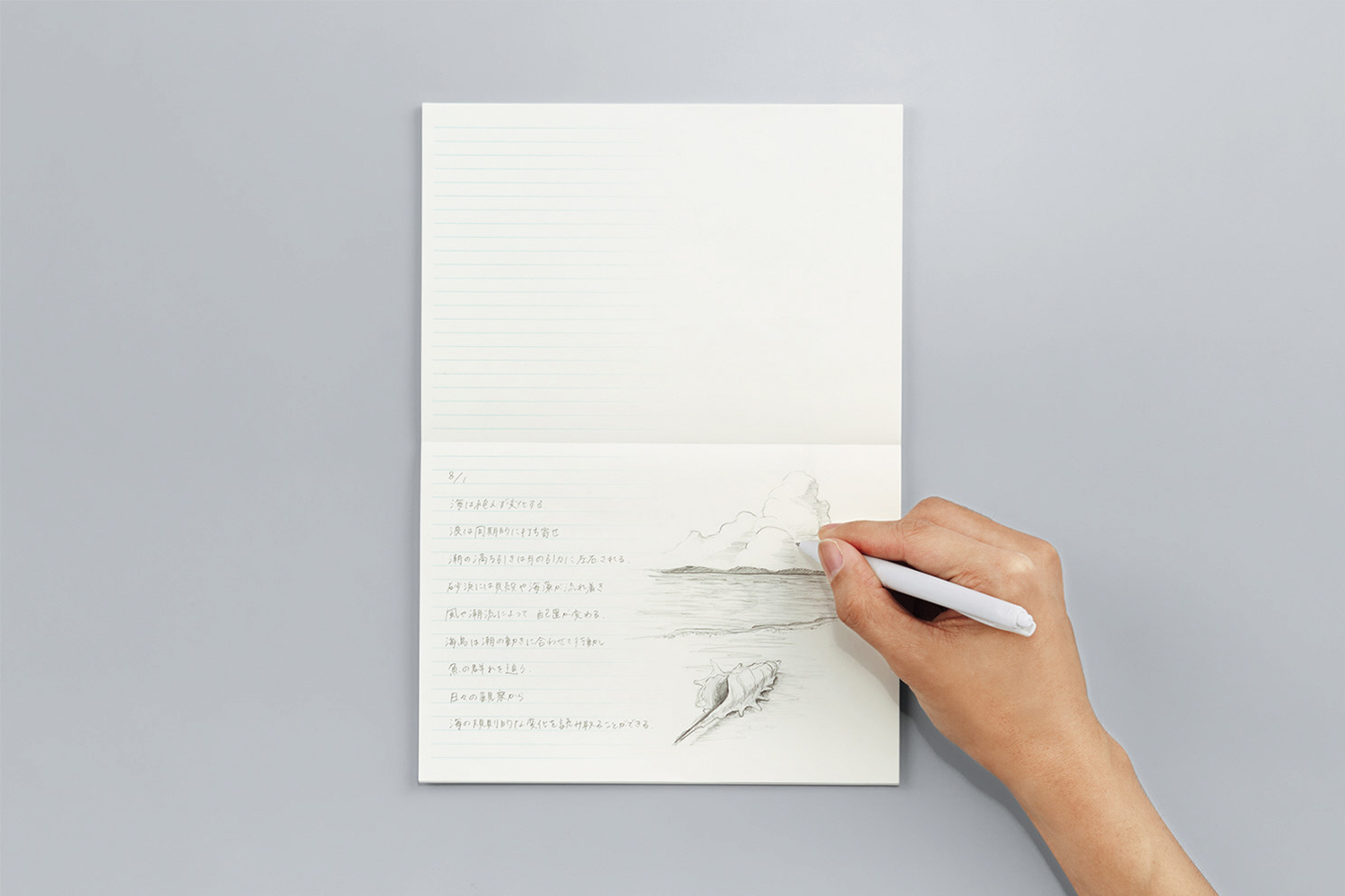
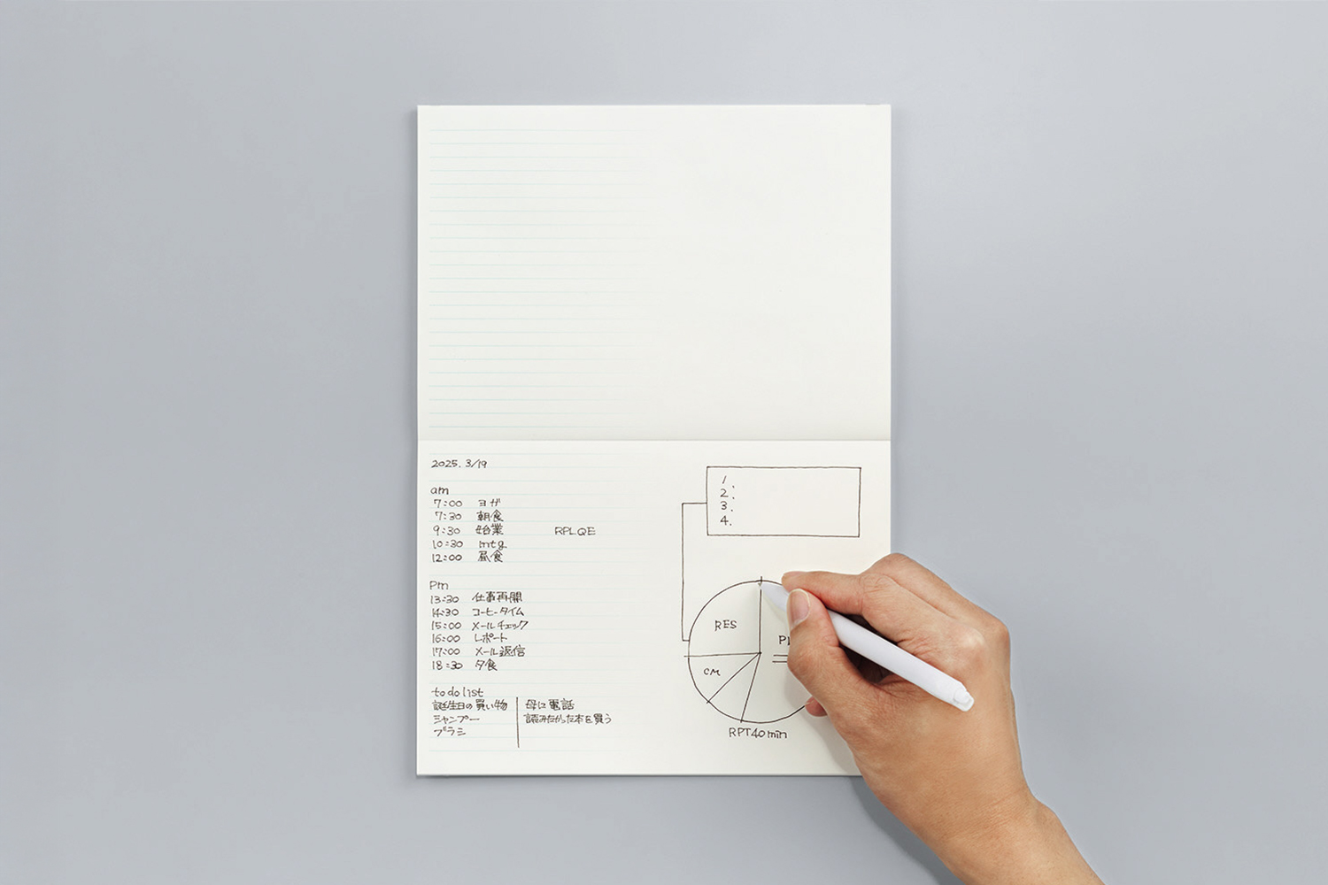
It is a new type of notebook that allows all the words, images, and
ideas that come to mind to coexist and flow effortlessly.
*Only available for purchase in Japan.
Motivation to Apply: Inspired by Past Award-Winning Works
The "EMBRACE NOTE" won the Merit Award at the KOKUYO DESIGN AWARD 2023. This notebook features a design in which the lines and margins blend in a gradation. It serves as a tool that embraces users' creativity, allowing text, diagrams, and illustrations to seamlessly coexist.
The artist, Guo Chenkai, is from China and studied product design at the graduate school of Tama Art University in Japan, and is currently active as a designer based in his home country, China. His decision to apply for the KOKUYO DESIGN AWARD was greatly influenced by his experience using KOKUYO stationery during his time studying in Japan.
"When I was studying in Japan, I had many opportunities to come into contact with KOKUYO products. I was fascinated by their design and functionality. In particular, seeing past award-winning works inspired me with their innovative approach to everyday life, which ultimately led me to apply."
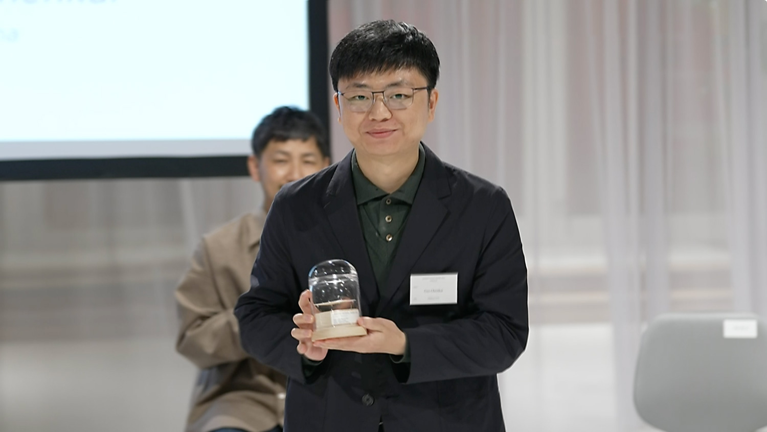
Artist Guo Chenkai (at the final judging)
This was Guo's second time applying for the KOKUYO DESIGN AWARD. Taking into account his previous experience, he explored the message that should be embedded in the 2023 theme, "embrace."
An Interpretation of "Embrace" Discovered During the Pandemic Lockdowns
When Guo began working on the project, he had just graduated and returned to China, where he experienced strict COVID-19 lockdowns that limited daily life. Amid these restrictions, encountering the theme "embrace" deeply moved him.
"At that time, the strict lockdowns in China created a strong sense of distance between people. Seeing the word 'embrace' made me reflect on the importance of 'softening boundaries.' As a result, I focused on notebooks, which had always been most familiar piece of stationery to me, and came up with a design that blurs the boundary between lines and margins," he explains, sharing the story behind the creation of "EMBRACE NOTE."
To Achieve Both Practicality and Design
After winning the award, the development of "EMBRACE NOTE" began immediately toward commercialization. The person in charge of this process was Shinpei Yoshida, who works mainly in the development of paper products at KOKUYO. Coincidentally, this is Yoshida's second time in charge of commercializing a product for the KOKUYO DESIGN AWARD, just like Guo, who had applied for the award twice. "While the 'EMBRACE NOTE' has a conceptual element, I saw great potential in its practicality. I felt that if this commercialization is successful, it could set a new standard for notebooks," Yoshida recalls his first impression of the design.
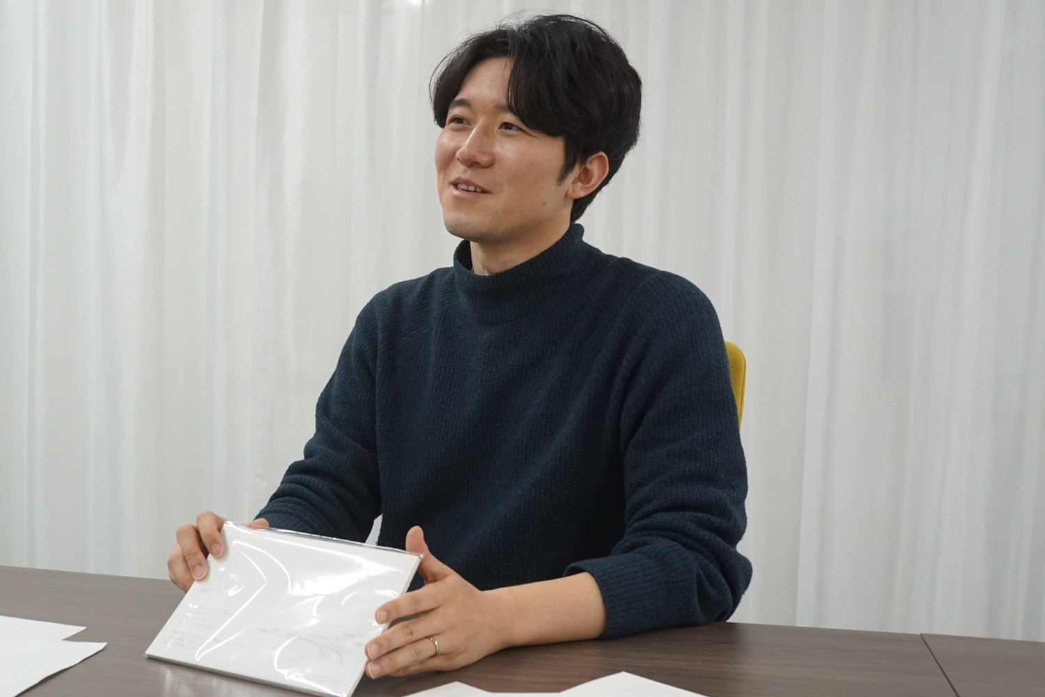
Shinpei Yoshida, development manager at KOKUYO
The process began with multiple prototypes. Various specifications, such as ring notebook and notebook size, were explored while creative professionals in KOKUYO were invited to use them and provide feedback. Many users appreciated the gradient-lined design, noting that it reduced the guilt of writing beyond the lines and enhanced the notebook's sense of freedom. At the same time, some concerns were raised, such as the compact field note size being convenient to carry but lacking enough space for free idea generation. The ring bound format, while practical, caused the rings to interfere with smooth writing and disrupt the thinking process. Taking this feedback into account, we ultimately decided on an A5-sized, lay-flat bound design, optimizing both usability and writing comfort.
Selecting the Right Printing Technique: A Breakthrough in Problem-Solving
KOKUYO has a long history of success in notebook development, including the "Campus Notebook." While one might think that commercialization would proceed smoothly, Yoshida recalls one major challenge, "It was particularly difficult to reproduce the subtle gradation of the lines using mass-production printing techniques." "Even though the gradient appeared smooth in the digital data, it often turned into tiny dots when printed, losing its seamless effect. Initially, we tried letterpress printing, but we had difficulty reproducing the design, so we switched to offset printing, which handles gradations more effectively, bringing us much closer to the intended design."
Guo also emphasizes that he was impressed by the process of his design taking shape through this trial and error. "Mr. Yoshida created numerous samples and refined them through repeated prototyping, allowing me to test them firsthand. The process of finding the optimal specifications while incorporating user feedback and factory test results was a very valuable experience."
The Goal Was to Create a Gradation Like the Shoreline
Yoshida's main focus in this development was to recreate the "ephemeral beauty" of the work. "Guo had a clear image of a 'shoreline' when envisioning the boundary between the ruled lines and margins. To express that, we had to be very careful about how thin the lines should be, where the gradation should start, and how well it smoothly fade, because if the lines were too bold, it would disrupt the intended aesthetic."
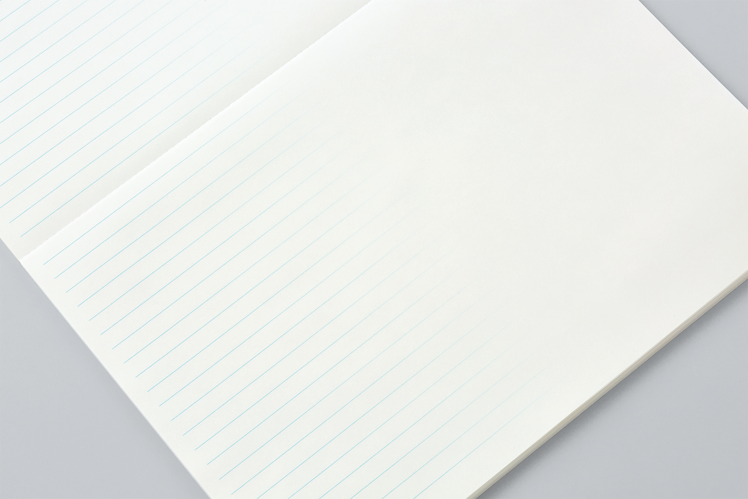
The goal was to create a subtle and ephemeral transition, like the delicate shoreline.
In addition, the cover was also carefully designed. Yoshida explained what he focused on during the development process. "By making the cover white, I wanted to highlight the ephemeral worldview of the work. Additionally, tracing paper was used for the belly band, overlaying a shoreline illustration onto a translucent material to create a poetic and atmospheric effect."
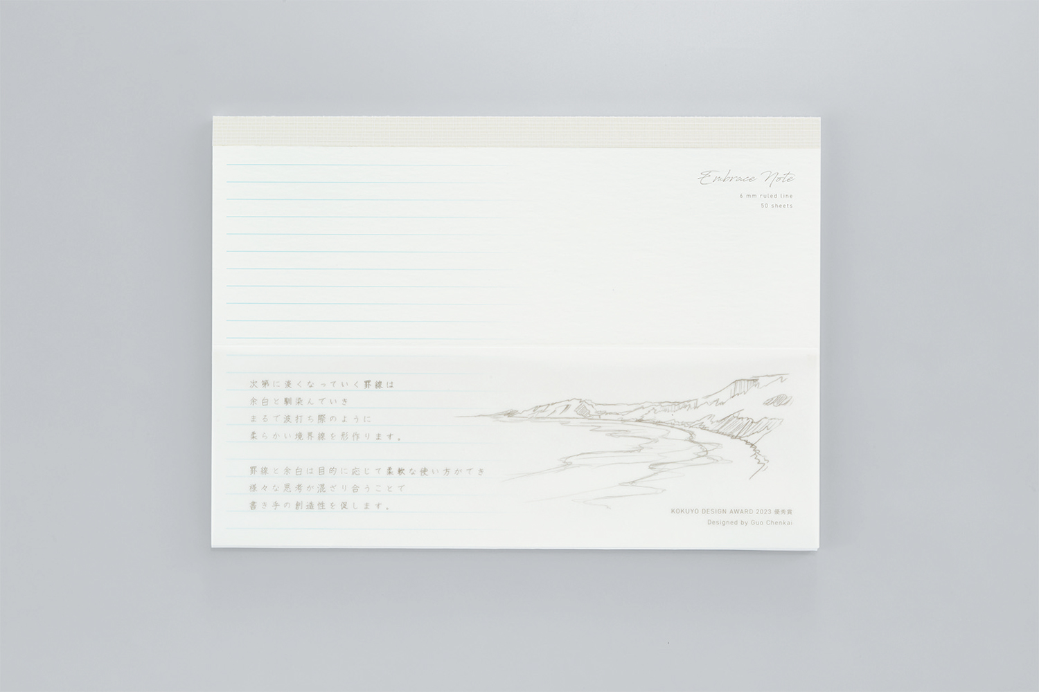
White-based colors and textured materials express the "ephemeral beauty" of the work.
The color of the lines is also a reflection of Guo's personal preferences. He recalled the events that inspired him. "During the development period, I happened to watch a Japanese romance drama. The setting was Hokkaido. The sky and snowy scenery in the video felt so ephemeral and breathtakingly beautiful. I wanted to bring that same atmosphere into 'EMBRACE NOTE,' which is why I chose blue for the lines."
Hope User Ideas Will Further Evolve The Work
This is how "EMBRACE NOTE" came to life. "By blurring the boundary between lines and margins, the design allows users to write freely without disrupting their train of thought. I hope this notebook becomes a tool that helps each person unlock their creativity," says Guo, expressing his hopes for the future of the product.
Furthermore, when asked about the ideal users for "EMBRACE NOTE," Yoshida responded, "Because it can be used in so many different ways, I don't want to limit it to specific users. I'd like a wide range of people to use it in their own way." By breaking free from fixed notions, each user can discover their own way of using the notebook, allowing "EMBRACE NOTE" to continue evolving. With this belief, Guo and the entire KOKUYO development team look forward to seeing how this notebook will fit into users' lives.


